Maps for Areal Data
R offers several ways to draw maps. Using the maptools library (which will also load the sp library), the generic plot method can be used with a SpatialPolygonsDataFrame object; in addition, the sp package offers spplot. There are other ways, e.g., those that rely on packages such as GIStools, maps, mapdata or mapproj. You may even read in maps from GoogleMaps with library RgoogleMaps. Perhaps this entry will deal with all these packages in some distant future, but at the moment only some basics are on offer.
The following examples refer to areal data, and currently it's about choropleth maps only. What I'm presenting here is to a large extent based on a paper by Roger Bivand, to wit, his chapter on Exploratory Spatial Data Analysis in the Handbook of Applied Spatial Analysis (Fischer, M.M., and Getis, A., eds, Heidelberg: Springer, 2010); it uses data about the quality of US medicaid services in the different states that were provided in Jacoby, William G. (1997), Statistical Graphics for Univariate and Bivariate Data (Sage University Paper Series on Quantitative Applications in the Social Sciences, 07-117). Thousand Oaks: Sage, pp. 37-8, and can be downloaded here (at least, this was true on 13 January, 2017) courtesy of Roger Bivand. What I'm trying to do here is to translate the rather abstract explanations provided by the R help system (and the description of the spdep package) into some more accessible language.
Spplot
A grey map to start with
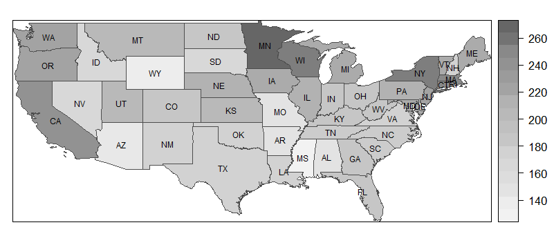
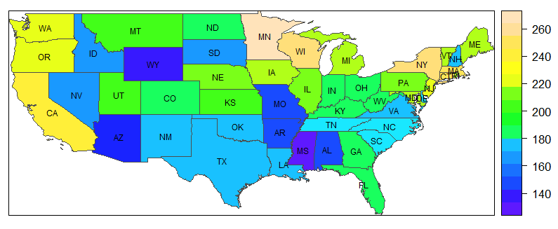
So, let's assume that a SpatialPolygonsDataFrame is at hand, as described in the previous entry. Now, a map without labels is created very easily. My example are the medicaid data described in the introduction.
spplot(medicaid, 'PQS', col.regions= grey.colors(20,.95,.4), col = 'grey30')
This command has four elements, which I will explain in turn.
- The first element,
medicaid, is the name of the dataset, or more specifically, the spatial polygon data frame. - The next element is the variable the values of which will be displayed using different colors (or shades of a color).
- The third element,
col.regions, indicates a set of "colors" (i.e., shades of grey [no pun intended]) to be used. The first value (20) indicates the number of colors (or shades) to be used, the second the starting grey level, i.e. the level for the lowest values (.95 is very light), and the third the ending grey level (which is medium dark to render visible the labels that will be added later – 0 would mean dark black.) - The final element,
col, refers to the borders of the polygons. Here,'grey30'means a shade on the darker side, whereas'grey100'would draw white bordes.
I will say more on colors shortly, but let me first show how to add labels to the plot. It is not easy to understand why it works the way it does, but if you know that the labels are stored in medicaid$STATE_ABBR, you may be able translate this to other examples, leaving everything else unchanged (i.e., everything that does not relate to the dataset and the variable label).
lbls <- as.character(medicaid$STATE_ABBR)
spl <- list('sp.text', coordinates(medicaid), lbls, cex=.6)
spplot(medicaid, 'PQS', col.regions= grey.colors(20,.95,.4),
sp.layout = spl, col = 'grey30')
Colors
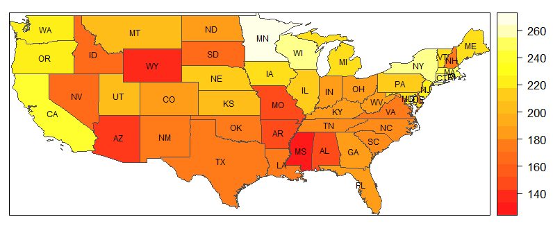
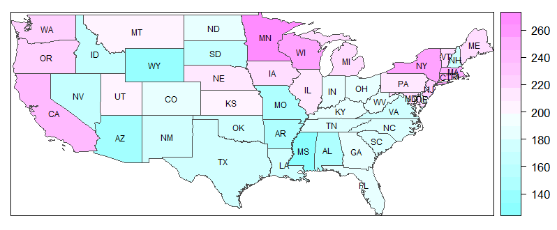
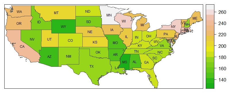
Instead of grey.colors, you may use other color schemes, or palettes. A generic palette is rainbow, but there are four specific palettes that use different parts of the color spectrum which make your maps look reasonable. The names of the schemes are given in the headers of the following examples. To use any of these palettes, just put xxx.colors(20,.9) en lieu de grey.colors() into the example command above. The first number gives the number of colors to be used and the second is the degree of (in)transparency. To wit, .9 (as used here) produces rather strong colors, whereas using .2 oder .1 would yield very pale maps.
heat.colors |
cm.colors |
|---|---|
 |
 |
terrain.colors |
topo.colors |
 |
 |
Combining maps into a panel
If you want to draw several maps related to the same phenomenon, it may be worthwhile to do so using a single panel. An important prerequisite is of course that the variables to be depicted have roughly the same scale. If this is the case, combining the maps is very easy: Instead of naming a single variable to be depicted as in the example above, use two or more, concatenating them with c(), as in c('var1, 'var2', 'var3').
Plot
The generic plot function can be put to good use with spatial polygon data frames. To produce choropleth maps, it has to be combined with packages RColorBrewer and classInt. This allows for more flexibility concerning the number of colours, and it offers a wide variety of colour palettes.
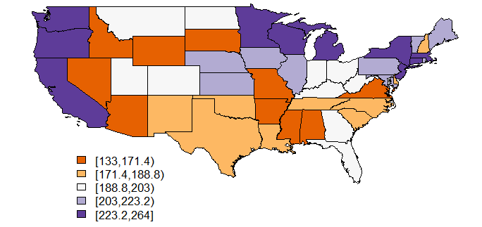
library(RColorBrewer)
library(classInt)
nclr <- 5
plotclr <- brewer.pal(nclr,"PuOr")
class <- classIntervals(medicaid$PQS, nclr, style="quantile", dataPrecision=4)
colcode <- findColours(class, plotclr)
plot(medicaid,col=colcode)
legend(-120,30, legend=names(attr(colcode, "table")), fill=attr(colcode, "palette"), cex=0.8, bty="n")
Some comments:
- The first two commands load the required packages.
classInthelps to divide the continuous variable into classes. - Now, an object is defined that represents the desired number of classes, and therefore the number of colors, for insertion in the commands that follow.
- The results of
brewer.palare stored in plotclr. The command requests "nclr" (i.e., five) colours from the "PuOr" palette. - In the next step, the five classes are built from the "PQS" variable by finding the appropriate quantiles.
- The
findColourscommand now associates the colours with the five classes created in the previous step. - Now, the map is plotted, and finally
- a legend is added.
Two comments on the classIntervals command are in order: The style "quantile" will produce awkward delimitations between classes in most cases, as can be seen in this example. You might try styles "pretty" or "equal", or some of the other styles information about which you can get by typing ?classIntervals. The "dataPrecision" option indicates the number of decimal places shown. Actually, the variable PQS has no decimals, and obviously one decimal is enough for creating the quintiles. I've shown this command only to remind you (and me) of this possibility.
Conditioned choropleth maps with CCmaps
At the moment, this is just a reminder that such things exist. Conditioned choropleth maps, quite unsurprisingly, are conditioned on the values of some variable. This variable must be either a factor or a shingle, or, put differently, a grouping variable.
For the time being, I have to ask you to use the help function to find out more. Try ?CCmaps, ?factor and ?shingle
© W. Ludwig-Mayerhofer, R Guide | Last update: 29 Jan 2017