Data and Distributions
This entry explains some graphs for metric data, many of which are also useful for comparing groups. More charts can be found in the following entries: Bar charts that depict (absolute or relative) frequencies are described in the entry about discrete data. Stem-and-leaf displays and box plots can be found in the entry on exploratory data analysis.
Some of the data used here (data set "quality") correspond roughly to the Medicaid program quality index data that can be found in Jacoby, William G. (1997). Statistical Graphics for Univariate and Bivariate Data (Sage University Paper Series on Quantitative Applications in the Social Sciences, 07-117). Thousand Oaks: Sage, pp. 37-8.
In other cases, I use a data set of my own, usually denoted by "do3", i.e., "data object 3".
The following plots are covered here: Strip plots | Histograms | Dot plots | Kernel density estimation | Violin plots | Bean plots | Beeswarm plots | Sinaplots
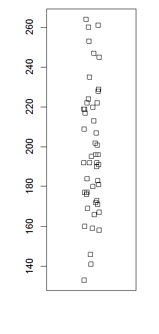
Strip plots
Strip charts are helpful particulary with small datasets. The basic command is, of course:
stripchart(mydata$quality)
I will typically help to "jitter" the data values, i.e. to add a small random component. Also, by default the strip plot is horizontal; to obtain the vertical chart that you can see here, another option is needed. So, all in all it goes like this:
stripchart(mydata$quality, method="jitter", vertical=T)
Some more options are available which you can learn about via the help system.
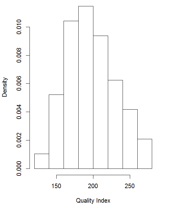
Histograms
A histogram can easily adapt to large samples and can be obtained as follows:
hist(mydata$quality)
Various options help controlling the display. Perhaps the most important among these gives you control about whether the graphs shows absolute or relative frequencies:
hist(mydata$quality, freq=F)
Note that usually a histogram is somewhat more spread out in the horizontal direction. I made this one a bit less wide just to test how it looks.
Dot plots
A dot plot as used here (in contrast to the Cleveland dot plot) is similar to a histogram, inasmuch as data are grouped into bins. See also this helpful website.
Univariate plots
To create the following plot, the ggplot2 package was used.
ggplot(do3, # Name of object containing data
aes(x=1, y=aeqeink)) + , # the "aesthetics", i.e. the elements to be plotted
geom_dotplot(binaxis='y', # the axis along which data are binned
stackdir='center', # direction of stacking of dots
method = "dotdensity", # actually the default; alternative: histodot
fill="white", dotsize=.5)+ # fill colour and size of dots
theme_classic(base_size = 15) + # background white, labels larger
theme(plot.margin = margin(1, 5, 1, 3, "cm"), # reduces width of plot
axis.text.x = element_blank(),
axis.ticks = element_blank()) +
ggtitle("") + # placeholder for plot title
xlab("")+ ylab("Income in Euro")# axis titles

Bivariate plots
ggplot(do3, aes(x=bildgr, y=aeqeink)) +
geom_dotplot(binaxis='y', stackdir='center',
method = "histodot", fill="#FFFFFF", dotsize=.5) +
theme_classic(base_size = 17) +
theme(plot.margin = margin(1, 3, 1, 3, "cm"),
axis.text.x = element_blank(),
axis.ticks = element_blank()) +
xlab("") + ylab("Income in Euro")

Kernel density estimation
The minimum version is:
plot(density(mydata$quality))
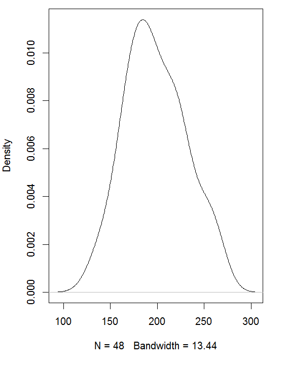
The default kernel is Gaussian, and the bandwidth is computed automatically. Both can be controlled by the user. The command
plot(density(mydata$quality,
bw=5, kernel="t"))
will set the bandwidth to 5 and make sure that a triangular kernel is used. An alternative method to control the bandwidth is to use adjust. Here you will indicate a factor by which the default bandwidth will be multiplied, as in
plot(density(mydata$quality,
adjust=1.3, kernel="t"))
The available kernels can all be abbreviated up to the minimum of just the initial letter, as in the example above. The kernels, apart from the default gaussian, are as follows:
epanechnikov |
rectangular |
triangular |
biweight |
cosine |
optcosine |
You will have noted that density is preceded by plot in the example commands shown above. By itself, density will just compute the density estimates, and if assigned to an object, the result will be of class density, which is a list the structure of which you may find out by using str(). In other words: There is no specific command to compute and plot densities; we use simply the density command to create a series of density values, which are stored together with the respective data values. In turn, the plot command will create a line diagram from the densities, graphed against the data values.
Violin plots
install.packages("vioplot")
Univariate plots
par(mai = c(1, 1.8, 1, 2),
mgp=c(1, 1, 0), bty = "n",
cex.lab = 1.3, cex.axis = 1.2 )
vioplot(do3$aeqeink ,las=1,
col = 0, rectCol = "blue",
xlab="", xaxt="n",
ylab = "HH Equivalent Income\n\n\n")

Note the triple "\n" at the end. This introduces three empty new lines after the title; I was forced to insert this because otherwise the label would have overlapped with the axis values.
Bivariate plots
par(mai = c(1, 1.3, 1, 1),
mgp=c(3,1,0), bty = "l",
cex.lab = 1.3, cex.axis = 1.2 )
vioplot(do3$aeqeink ~ do3$bildgr,
h = 500, las=1,col = 0, rectCol = "blue",
xlab= "Education",
ylab = "HH Equivalent Income")

Bean plots
install.packages("beanplot")
Univariate plots
par(mar=c(4,8,4,16), bty = "n")
beanplot(do3$aeqeink,
col= "white", log="", bw=400,
ylab="Household equivalent income",
maxstripline=0.05, cutmin=0,
cex.axis = 1.6, cex.lab=1.6)

Bivariate plots
par(mar=c(4,8,4,4), bty = "n")
beanplot(do3$aeqeink ~ do3$bildgr,
col= "white", log="", bw=400,
xlab="Education",
ylab="Household equivalent income",
maxstripline=0.08, cutmin=0,
cex.axis = 1.6, cex.lab=1.6)

Beeswarm plots
install.packages("beeswarm")
Univariate plots
par(mar=c(4,8,4,18), bty = "n")
beeswarm(do3$aeqeink ,
ylab = "HH Equivalent Income",
cex.axis = 1.6, cex.lab=1.6)

Bivariate plots
par(mar=c(4,8,4,8), bty = "n")
beeswarm(do3$aeqeink ~ do3$bildgr,
xlab="Education",
ylab = "HH Equivalent Income",
cex.axis = 1.6, cex.lab=1.6)

Sinaplots
install.packages("sinaplot")
Univariate plots
par(mar=c(4,8,4,16), bty = "l")
sinaplot(do3$aeqeink , method="counts",
bins=10, seed = 123454, ylab = "HH Equivalent Income",
cex.axis = 1.6, cex.lab=1.6)

Bivariate plots
par(mar=c(4,8,4,8), bty = "n")
sinaplot(do3$aeqeink ~ do3$bildgr,
method="counts", bins=10, seed = 123454,
xlab = "Education",
ylab = "HH Equivalent Income",
cex.axis = 1.6, cex.lab=1.6)

References
- Eklund, A., & Trimle, J. (2021). Package 'beeswarm', https://cran.r-project.org/web/packages/beeswarm/beeswarm.pdf.
- Hintze, Jerry L./Nelson, Ray D. (1998) Violin Plots: A Box Plot-Density Trace Synergism, The American Statistician, 52:2, 181-184, DOI: 10.1080/00031305.1998.10480559.
- Jacoby, William G. (2006): The Dot Plot: A Graphical Display for Labeled Quantitative Values, The Political Methodologist. Newsletter of the Political Methodology Section, American Political Science Association, Vol. 14, Number 1, pp. 6-14.
- Kampstra, P. (2008). Beanplot: A Boxplot Alternative for Visual Comparison of Distributions. Journal of Statistical Software, 28(Code Snippet 1).
- Sidiropoulos, N., Sohi, S. H., Pedersen, T. L., Porse, B. T., Winther, O., Rapin, N., & Bagger, F. O. (2018). SinaPlot: An Enhanced Chart for Simple and Truthful Representation of Single Observations Over Multiple Classes. Journal of Computational and Graphical Statistics, 27(3), 673-676. doi:10.1080/10618600.2017.1366914.
- Wilkinson, Leland (1999): Dot plots. The American Statistician, Vol. 53, No. 3, pp. 276-281.
© W. Ludwig-Mayerhofer, R Guide | Last update: 03 Aug 2025