Combining Graphs
This entry describes how you can arrange several graphs into a single panel (or window). it refers to the standard R graphs; it may not work with graphs from special packages.
Note that this is different from combining several views of data into a single graph, which may be described later on in a different entry. For instance, you may create a scatter plot and add strip plots (or boxplots) on the x and the y axis to highlight the univariate distributions. Here, you end up with a single graph. This section, in contrast, deals with the case where you may create, e.g., several scatterplots, but wish to arrange them so as to appear side by side (or above each other) in the graph window.
The section describes two commands to achieve this. In my experience, the first one, par(mfrow)/par(mfcol)is encountered more frequently on the internet, most likely because of its simplicity. In contrast, the second command, layout(), offers more flexibility. Note that there is a third command, split.screen, with which as yet I have no experience.
A practical advice
When dealing with multiple graphs, you may easily get lost (or stuck), particularly when mixing different types of elements. It may just happen that R does not recognize that a certain piece of text or graph is meant to appear in the next panel, and it may be difficult to get out of the mess you're in at this moment. So, how to start anew?
The best solution I have encountered thus far is the command dev.off(), which simply closes the graph window and in most cases will reset parameter values. Now, you can start again, hopefully with better luck.
Using par(mfrow)/par(mfcol)
The par(mfrow) and par(mfcol) commands tell R to divide the graph window in a number of "cells" and how to fill these. Imagine the cells like a matrix of rows and colums: If the graph window is supposed to be divided into four cells, two in the upper half and two in the lower, this is similar to a matrix with two rows and two colums.
So, par(mfrow) and par(mfcol) simply indicates the number of rows and columns to be filled with the plots that follow. Note that both commands basically do the same thing and therefore only one of them is needed. The difference is how the plots are distributed over the columns: With par(mfrow), R will start to fill the first row and then proceed to the second, whereas with par(mfcol), R will first fill the first column, then the next column, and so on. So
So, here is a fictitious example using data "mydata" with variable "age" and "income".
par(mfrow=c(2,2))
boxplot(mydata$age)
boxplot(mydata$income)
plot(density(mydata$age))
plot(density(mydata$income))
This will produce a panel with two boxplots in the first row and two kernel density plots in the second.
Using layout
Note first that layout is not compatible with par(mfrow)/par(mfcol), so if you have tampered with the latter it is advisable to reset it to par(mfrow=c(1,1)) prior to using layout.
Secondly, layout may cause trouble just because of its flexibility. Therefore, its use may require some search on the web for the source of problems you may encounter. Still, it's worth a try because it can do things par(mfrow)/par(mcol) cannot.
So, why use layout? Thinking again (as in the previous section) of dividing the graph window into a number cells, layout can do at least two things: First, it allows to distribute a plot over more than one cell, if necessary, and second, it gives you more flexibility concerning the size of the cells. Here's an example:
layout(matrix(c(1,2,3,3), ncol = 2, byrow = TRUE), height = c(4,0.8) )
The matrix part indicates that the plot window is supposed to have four cells, with the numbers referring to the plot elements that follow. In other words, the first plot that follows will end up in the first cell, the second in the second cell, whereas the third element will cover both the third and the fourth cell. The ncol parameter informs are that the four cells are to be distributed over two colums, with the byrow= T option making clear that the first two elements will fill the first row of the panel. Finally, the height parameters defines the height of the two rows in relative terms. In other words, the upper part (where the first two graphs will go) has five times the size of the lower part. (Why? The lower part will receive a legend only which needs much less space.)
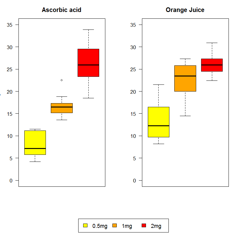
Here's a lenghty example that uses again a "built-in" R dataset. I have used an example by Roger Bivand which is provided upon ?boxplot. Note that his version is better than what follows; I have just adapted this example to explain the use of layout.
attach(ToothGrowth)
layout(matrix(c(1,2,3,3), ncol = 2, byrow = TRUE), height = c(4,0.8) )
par(mai=rep(0.5,4))
boxplot(len ~ dose, subset = supp == "VC", col = c("yellow", "orange", "red"),
main = "Ascorbic acid", ylab = "tooth length", ylim = c(0, 35)), xaxt="n")
boxplot(len ~ dose, subset = supp == "OJ", col = c("yellow", "orange", "red"),
main = "Orange Juice", ylim = c(0, 35), xaxt="n")
par(mai=rep(0,4))
plot.new()
legend(x="center", ncol=3, legend=c("0.5mg", "1mg", "2mg"),
fill = c("yellow", "orange", "red"),cex=1.1)

A few notes: First, the change of margins requested with par(mai ...) is important particularly before the last command, because otherwise the legend would never appear – it would be just swallowed up by the margins. The plot.new() command informs R that what follow is to be a new (i.e., the third) plot.
© W. Ludwig-Mayerhofer, R Guide | Last update: 03 Apr 2017