Changing the Look of Elements of the Graph
Lines
In a line chart, you may distinguish different lines by colour or pattern. You may also wish to change the thickness of the line.
Line pattern
The pattern of the line may be changed via option lpattern, such as in
line sales1 sales2 year, lpattern(solid dash)
with the first line being drawn as a solid line and the second as a dashed line. Other pattern styles are dot, dash_dot, shortdash, shortdash_dot, longdash, longdash_dot or blank. The last option is just in case you wish to draw an invisible line for some reason or other. You may also create your own line pattern with the help of a "formula", such as in
line sales1 sales2 year, lpattern("_-." "__#")
You may combine elements _ (underscore = long dash), - (hyphen = medium dash), . (dot = short dash) and # (= small amount of blank space). "l" (small l) will draw a solid line.
Line width
The width, or thickness, of the line may be changed via option lwidth, such as in
line sales1 sales2 year, lwidth(medium)
Apart from some keywords that are available (such as medthin, vthin [for very thin], or thick [which will be too thick in most cases]), you can use numbers, as in lwidth(*1.2), which will multiply the default width by a factor of 1.2, or in lwidth(1.2), with the value in parentheses difficult to interpret in substantial terms (it refers to a percentage of the width or height of the graph, whichever is smaller -- but to translate this into line width is not easy).
Filling colours
Often, you may add an option referring to the colours used to fill bars or boxes.
Histograms
With histograms, try the fcolor() option. You may refer either to a colour, such as in
histogram age, fcolor(green)
or a degree of whiteness, as in
histogram age, fcolor(gs16)
Find more about filling colours by typing help colorstyle.
Bar charts
graph bar (percent), over(education) bar(1, bfcolor(white) blcolor(black))
will yield white, i.e. blank, bars that are delineated by black lines. That is, bfcolor refers to the "filling" of the bar, whereas blcolor stands for "bar line".
Note, however, that the look of the bar can be modified in other ways as well, and these interact with bfcolor and blcolor. These modifications come from the intens[ity] and lintens[ity] options (for intensity [of color] and line intensity). These options refer to the overall graph, i.e., they are not associated with a specific bar (bar(1, ...) but stand alone. intens(0) will reduce the intensity of the filling colour to zero (i.e., to white), whereas intens(255) will yield the full flavour. intens(*#) will change the intensity compared to the default value. intens(*.5) will yield half the intensity and intens(*2) will double it.
The same holds for lintens[ity], but note that whatever you do with this option, it will be overriden by a blcolor option associated with a bar, as described in the example above.
Finally, the thickness of the line that outlines the bar can be influenced with lwidth(), which is used as a sup-option to the bar() option, just like bfcolor or blcolor. For a description, see the first section (on line charts) of this entry.
Box plots
As far as box plots are concerned, I'm not certain whether (and if so, how) you may change the colour of the box. However, the intensity() option allows you to regulate the amount of colour used for the box. intensity(0) will deliver a white box, with a maximum of 100 for the highest intensity.
Marker symbols
The symbols
Scatter plots, "connected" line plots and probably a number of others will depict data points by symbols such a dots (circles), squares, triangles etc. You may specify the desired symbol by way of adding an option to the respective graph command, as in
twoway connected unempl year, msymbol(O)
So, what is msymbol(O) standing for? Well, perhaps you have guessed that the O (note that this is letter O, not number zero!) represents a circle, and yes, you're right. But there is a bit more to it. So let's get briefly into systematics.
(1) There are six symbols: Circles, diamands, triangles, squares, plusses (i.e., +), and x.
(2) With the exception of the plus sign, for each symbol there is a large and a small version.
(3) The geometrical symbols (i.e., all with the exception of the plus sign and the letter X/x) may be either solid (i.e., filled with colour) or hollow.
Now, in the example above, I used the capital (or "large") letter O, which means that I requested a large circle. So, for a large diamond/triangle/square/X, use capital letters D, T, S, and X, respectively, whereas for the small versions, use small letters. And what about the solid or the hollow version? Well, by default the symbols are solid, and therefore nothing is required to obtain a solid symbol. In contrast, if you prefer a hollow symbol, add letter "h". So, a large hollow circle will be obtained via msymbol(Oh).
For completeness's sake, let me mention that instead of the abbbreviations outlined in the preceding, you may also use the full names. So, instead of msymbol(O) I could have used msymbol(circle) (with a small letter at the start). To obtain a small circle, write msymbol(smcircle), and to make it hollow, add msymbol(smcircle_hollow). Note that, whereas the full names for the large symbols typically start with a small letter, this is not the case for a large X; here the "full name" likewise is a large, i.e., capital, X, whereas the full name for the small x is smx.
Defining the look of the symbol
You can determine the look of the marker symbols in very much detail. Here, I will mention only the basic options:
| msize() | the size of the marker symbol (see text below table) | |
| mcolor() | colour of the marker, both inside and out (i.e., the outline) | |
| mlcolor() | colour of the outline | |
| mfcolor() | colour inside the symbol (the "filling" color) | |
| mlwidth() | the thickness of the outline | |
| mlstyle() | the overall style of the outline (run help linestyle) |
|
| mstyle() | the overall style of the marker (run help markerstyle) |
A note on marker size: This can be indicated, among other things, either in relative (msize(*2) will make it twice as large as by default) or in absolute terms (as in msize(tiny)). For more information, run help markersizestyle.
General marker styles
There are some general marker styles that define several elements of the marker symbols at the same time. They may be used as in
scatter unempl dgp, mstyle (p4)
There are fifteen differents styles, p1 to p15. Note that their look also depends on the overall scheme you may be using. Find out more with help markerstyle.
Marker labels
Adding labels
In some cases, such as scatterplots, it may be both feasible and helpful to add marker labels. For instance, you may have information about a number of countries. Here, it would be great to add country codes to your plot, as in the following example:
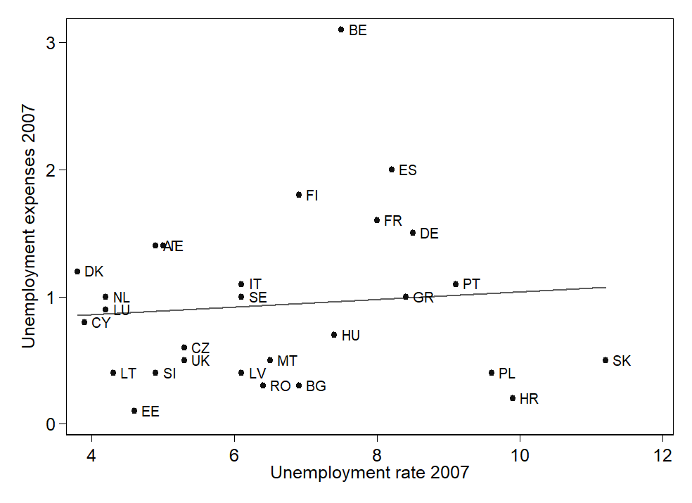
The option to add marker labels is mlabel(labelvar), where labelvar is variable with value labels. Here is the full code for the graph:
graph twoway (lfit uexp07 ur07) scatter uexp07 ur07, ///
symbol(o) mcolor(gs1) mlabel(land) ylabel(, angle(0)) legend(off) ///
xtitle("Unemployment rate 2007") ytitle("Unemployment expenses 2007")
(Note that here two graphs are overlaid; see the entry on overlaying graphs.)
Position of labels
In the example graph above, two data points (at about x=4.8 / y=1.4) are so close to each other that the labels overlap. You may also be unhappy with the fact that the regression line cuts through the label for Greece. You might feel the same concerning Luxemburg; but shifting the label for Luxemburg may also affect the position of the label for the Netherlands.
The trick to change the position of one or several labels works as follows: You need a variable that indicates the position of each label relative to the corresponding data point. The information contained in this variable is submitted to Stata via the mlabvpos(label-position-variable), with label-position-variable as the name of the variable in question.
Which information will Stata understand? Imagine a clock. A label normally is positioned on the right hand side of the respective symbol. On a clock, this would correspond to 3 o'clock. Do you want the label to be positioned a little bit further up (but still on the right hand side)? Use 1 or 2 o'clock. And so on. Therefore we will want to create a variable that has a value of 3 for all cases where the position of the label is to remain unchanged. Then, we will change this variable to the appropriate value for those cases where a shift of position is required (or desired).
In our example, we want to do two things: First, in the case of the two overlapping labels, we want to place the label for the country with the lower unemployment rate on the left of the data point (at 9 o'clock). Second, we will want to shift the label for Greece, and possibly also Luxemburg, and consequently the Netherlands, a bit upward (to 2 o'clock).
Therefore, we will add some code such as the following to our do file:
gen mpl = 3
replace mpl = 9 if land == 1
replace mpl = 2 if inlist(land, 9, 18, 21)
Then, we will add mlabvpos(mpl) to the options for the graph, with the following result:
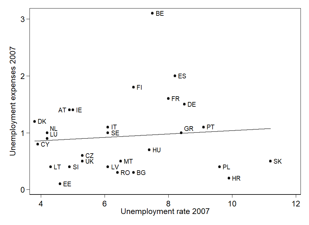
A further refinement: You may even change the default distance between the data points and the marker labels, using the mlabgap(*#) option. Here, # refers to a multiplying factor. mlabgap(*.3) will considerably reduce the distance, mlabgap(*2) will double it. Note, however, that as far as I know you cannot tailor the distance individually to each data point.
But that's not yet all. Find out more via help marker_label_options.
Adding elements to your graphs
Lines
A horizontal line at a given value of y, say, 1.5, may be added with option
yline(1.5)
Several numbers may be enclosed within the parentheses, producing several lines.
A vertical line at a given value of x, say, 3, not suprisingly is added with option
xline(3)
Again, several values may be enclosed within the parentheses, producing several lines.
Other lines may be drawn by overlaying the graph with a function. Here is an example:
graph twoway (scatter growth2010 growth2000) (function y = x, range( growth2000))
This will draw a line at a 45 degree angle, i.e. a line at x = y. The point here of course is that this line divides those whose growth has increased from 2000 to 2010 from those where it has decreased over time. The range option ensures that the function is available over the entire range of the variable on the x axis (by default the range is 0 to 1).
© W. Ludwig-Mayerhofer, Stata Guide | Last update: 11 Jun 2019