Combining Graphs
Combining graphs is a complex issue, and I will try to address it more fully in due course. For the time being, the entry collects only some stuff I found more or less incidentally.
Combining graphs can mean several things, and it's perhaps not always easy (or straightforward) to distinguish combined graphs from those graphs that show several diagrams in a single graph, i.e., overlaid graphs. The cases I wish to describe here are somewhat more complex. You may, first, combine graphs for two or more groups in a single display using the by option. That is, you will build some graph and tell Stata to do the same thing not once for all cases, but repeatedly for subsets of the data. You may, second, combine whatever graphs you have produced using indeed the combine command. The latter is meaningful if, for some reason of other, you have to bring together heterogeneous information in a single visual display.
The by option
Using by as an option to a graph is very simple, in principle. As everywhere when by is used, it just means that a command you have written is executed not for all cases, but rather separately for two or more groups. As a result, you will have two or more displays side by side, or on top of each eather. But of course, the challenge to produce a meaningful and appealing graph may rise with the complexity of your graph. As pointed out in the introduction, I will address these issues by and by.
So, let's start with a very simple example.
scatter lfp08 expchildc, by(EA1990)
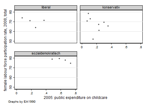
This shows aggregate data for female labour force participation by public expenditure for child care (OECD data). The graph is repeated for three groups, to wit, welfare state regimes according to Esping-Andersen's seminal "Three worlds of welfare capitalism" (Oxford University Press, 1990) (sorry for the German labels). Note that the scale of the axes is the same in all three displays. Note also the note on the bottom left about the graph being repeated "by EA1990". Normally, this is something you will wish to make clear in the title of the graph; the note can be suppressed by adding a sub-option to the by option, as in by(EA1990, note("")).
The graph is labelled more or less satisfactorily because I had defined variable and value labels for the variables used. All in all, while it's certainly not a real beauty, I think this is not a plot to be ashamed of. So, with some luck you may get a fine graph without too much work.
Labeling the axes may be difficult in more complicated cases. Let's start with the complex enough example of an overlaid graph, where you might wish to show several lines, with some of them on different scales (typically two). You may indicate this by displaying one scale on the left hand side of the graph and the other one on the right hand side. The following graph shows such a case (labels in German), with absolute numbers on the left and percentages on the right. It employs the feature of distinguishing between two axes, referring to "axis(1)" and "axis(2)" (what follows is only an excerpt).
twoway (line NA_alle Jahr, c(l) yaxis(1) ylabel(0 (5) 35, angle(0) axis(1)) ///

   ytitle("absolut (in Millionen)", axis(1)) ytitle("Prozent", axis(2))     ///

   ... more code ...)  (line ... more code ...)  (line ... more code ...)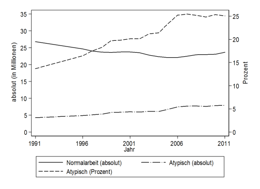
But when I tried to apply this to a combined graph, showing the same figures for men and women separately, that "axis(1)" and "axis(2)" stuff didn't work anymore. To obtain "Prozent" (i.e., per cent) on the right, I had to use an (sub-)option to the by option which I found in a short Stata Journal article by Marteen Buis and Johannes Weiß, which I barely understand (the sub-option, that is; it has something to do with text fields), and it goes like this:
twoway (line NA_alle Jahr, c(l) yaxis(1) ylabel(0 (5) 35, angle(0) axis(1)) ///

   ytitle("absolut (in Millionen)") ... more code ...)                      ///

   (line ... more code ...)  (line ... more code ...)                       ///

   , by(geschl, note("") r1title("Prozent"))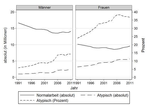
© W. Ludwig-Mayerhofer, Stata Guide | Last update: 09 Apr 2015