Bar Charts that Represent Associations Between Variables
Please note: SPSS has added a lot a graphing possibilities recently; regrettably they have been changing rather fast (there was an IGRAPH command which then was deprecated and does not work anymore in version 18.0; version 18.0 has an GGRAPH comand instead). Consequently, this section is not really up-to-date. Yet, what you'll find here still works, as far as I know.
Bar charts may be used to represent associations between variables. Look at the following table that shows how respondents evaluate the size of the flat they are living in, depending on the number of rooms available. (Note: Normally one would look at the number of rooms available per person; my example serves demonstration purposes only). The example is from real data, provided by the German Socio Economic Panel study (see the project homepage in German or in English).
| 1 Room | 2 Rooms | 3 Rooms | 4 Rooms | 5+ Rooms | n |
|
|---|---|---|---|---|---|---|
| Much too small | 13 | 4 | 3 | 1 | 0 | 79 |
| A bit too small | 30 | 22 | 21 | 11 | 6 | 523 |
| Just about right | 56 | 72 | 72 | 76 | 74 | 2334 |
| Somewhat too big | 0 | 2 | 5 | 12 | 17 | 261 |
| Much too big | 1 | 0 | 0 | 1 | 2 | 24 |
| n | 135 | 608 | 1084 | 696 | 598 | 3221 |
This table can be represented by bar charts in two ways. I usually recommend the second way, but in the final analysis the choice should depend on what readers are supposed to see.
The first way is to use a grouped bar chart to display percentages as follows:
| GRAPH | |
| /TITLE 'Evaluation of size of flat, by number of rooms' | |
| /FOOTNOTE 'Source: GSOEP, wave 1997, student subsample' | |
| /BAR(GROUPED)=PCT BY nwgurt BY nwohnr. | |
Note that nwgurt is the variable "Evaluation" and nwohnr is "Number of Rooms". The chart produced by SPSS looks like this:
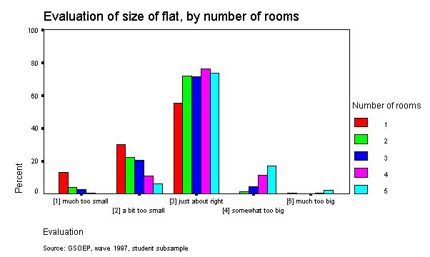
What this chart exhibits immediately is that most people evaluate the size of their flat as "just about right"; much smaller are the percentages of those who feel it is too small or too big. On a second glance, one may also discern a pattern: The percentage of those who think their flat is much too small is biggest among those with 1 room only, and it decreases with number of rooms. The same pattern applies to those who think their flat is a bit too small. The reverse can be discerned with respect to those who think their flat is too big or much too big: Here, those with 1 room virtually do not show up at all, whereas at least a small percentage of those with 4 or 5 rooms can be seen to hold the view that they may occupy too much space.
The second way to exhibit the relationship between the two variables is a stacked bar chart:
| GRAPH | |
| /TITLE 'Evaluation of size of flat, by number of rooms' | |
| /FOOTNOTE 'Source: GSOEP, wave 1997, student subsample' | |
| /BAR(STACK)=COUNT BY nwohnr BY nwgurt. | |
Note, first, that the order of variables is reversed when compared to the command for a grouped bar chart. Second, you have to further elaborate on this chart after it has been produced. This is because the initial version displays frequencies (or "counts"), but we wish percentages that add up to one hundred percent. To achieve this you have to do the following:
- Double click on the chart (in newer versions -- I think 7 and later) or click on the Edit (in English versions of SPSS) or the Bearbeiten button (in German versions of SPSS).
- Click on "Chart" or "Grafik" on the Menu Bar and then on "Options" or "Optionen"
- Tick the small box that should say something like "Set scale to 100 %" (or so I believe) or "Skala auf 100 % setzen".
- Afterwards, SPSS most likely still displays "count" on the left side of the chart; this of course must be replaced by "Percent" (or "Prozent") (doubleclicking on "count" will allow to do this).
The result should look like this:
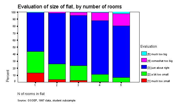
In my opinion it now becomes much clearer that the percentage of those who think their flat is too small decreases with the number of rooms and the percentage of those wo feel it is too big increases. In other words, the association between the two variables becomes clearer.
If you want to display this chart in print and do not have access to a colour printer, the default display of colours (at least in the version I use) will not be very meaningful. In my opinion, the colours -- which will be displayed as shades or degrees of grey -- should reflect that the categories displayed are ordered. The following colours should work out good enough on most black and white printers (the chart should look o.k. in print -- it looks slightly strange here because I had to work on it a bit for Internet display):
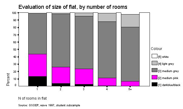
With black and white printers, usually not more than 5 categories (=shades of grey) can be displayed meaningfully. However, the use of fill patterns (instead of different colours) is strongly discouraged. If you do not understand why, collect a small bunch of charts that use fill patterns, have a look at them and simply try to find a honest answer to the question whether or not they are rather ugly. (If you think they are not, please be sure not to pick me as your thesis supervisor.)
© W. Ludwig-Mayerhofer, IGSW | Last update: 11 June 2002