Internet Guide to Stata |
Print article |
Suppose you want to show the association between two variables, say, labor force particiption of mothers and enrolment of children in public childcare (both variables are measured at the aggregate levels, i.e. as percentages). You might first create a scatterplot of the two variables, writing
twoway scatter ccenrol lfpm
You might also think that the relationship is more or less linear and therefore you might, second, create a plot with a line fitted to the data via linear regression:
twoway lfit ccenrol lfpm
Of course, it would be nice to show both the scatterplot and the fitted line in a single diagram, as in
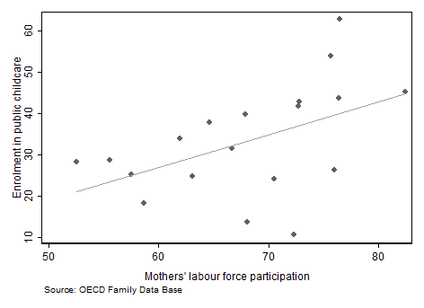
What this graph demonstrates is overlaying. It differs from combining graphs where several plots are stacked besides or beneath each other. There are two easy ways how overlaying can be achieved in Stata:
twoway (scatter ccenrol lfpm) (lfit ccenrol lfpm)
or, alternatively
twoway scatter ccenrol lfpm || lfit ccenrol lfpm
Note that even though both diagrams have been overlaid, it's still two separate plots, and therefore any option must be 'attached' to one of the two plots (or perhaps to both), such as in:
twoway (scatter ccenrol lfpm, legend(off)) (lfit ccenrol lfpm)
Be sure to have noticed that legend(off) has been placed within the parentheses that define one of the plots. (In this instance, as in many others, it does not matter whether you choose the first or the second plot).
© W. Ludwig-Mayerhofer, Stata Guide | Last update: 02 Aug 2015